


March 8, 2018 – Their design is the most beautiful accessory of the Olympic Games: The medals which are newly created for every Olympic competition. In their latest issue, the art magazine Hyperallergic has dedicated an extensive article to the medals of the Winter Olympics on 2018 in Pyongyang.
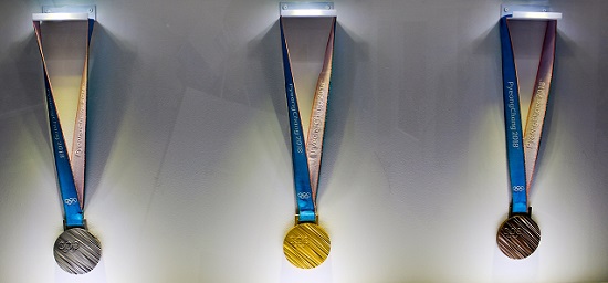
The Olympic medals that were made for the games in Pyongyang. Photo: Trainholic / Wikipedia CC-BY 4.0.
The article informs us that the Olympic committee individually decides if they want to organise a competition or directly approach one artist. For the 2018 medal, the committee chose the South Korean industrial designer Sukwoo Lee. He presented the committee with five designs. They chose the most modern draft, which completely passed on representationalism.
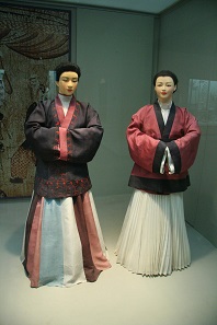
The traditional Hanbok, which is part of the Korean woman’s costume, features a similar structure as the Olympic medals. Photo: bdnegin / Wikipedia CC-BY 3.0.
But the design is much more than just a pattern. There is a complex idea behind the pattern – the alphabet. Letters are sown like seeds and culture can grow from these seeds. Flowers and fruit are like the different cultures that grow from different seeds. The medals are therefore a symbol for all the different cultures participating in the Olympic Games, arranged like a field of flower stalks. The individual stripes can also represent different cultural products. In addition, these structures can often be found in Korean culture, be it in traditional clothing or on traditional Korean tile roofs.
If this description is too theoretical for you, please have a look at the images of this article by Hyperallergic
All Olympic medals are presented here.
More products by the designer can be found at the website of the SWNA, his design-company.